MassLandlords.net is at the point where we have enough traffic to learn something about our site design, in particular, our conversion rates for member sign-ups. Here’s an update that speaks simultaneously to how new I am at this, and also to the kinds of opportunities we have with statistical analysis.
The site has a “join” page, which presents visitors with two options:
- Give us just your email now to subscribe to our monthly newsletter; or
- Pay us now to have full access to the site and/or local meetings.
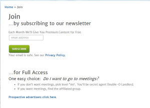
On May 21, the top part of the page went from this:
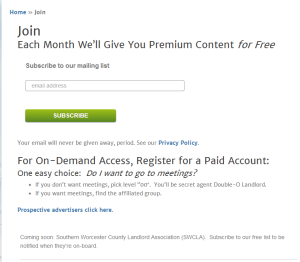
to this:
 If I were to summarize the differences, I’d say:
- Fewer words
- Easier English (“newsletter” instead of “each month we’ll blah blah blah”)
- Tighter focus on alternatives with the ellipsis
The big, juicy “button” visible in these screenshots submits your email to register as a free member. The really best features of the site are accessible only to paid members, and all the payment options are further down the screen. Since the paid sign-up design remained constant through the May 21 transition, I’m leaving it out of the analysis here.
One month later, today, here are some changes we’ve observed:
- “Time on page” down 42%
- “Bounce rate” down 56%
- Rate of sign-up for the “free monthly newsletter” up 7x (700%)
- Paid registration rate down 50%
Are those changes significant?
Enter what my brother taught me, “Fisher’s exact test.” The probability that I would have gotten these results by random chance was very high for all changes, save one:
The odds of the free sign-up changing 7x by random chance are 1%.
Conclusion? Maybe Landlords don’t want “each month we’ll give you premium content for free.” What the hell does that mean? But a newsletter? Yeah, that sounds good.
But we should be careful. All the statistics tell us is that between May and today, the people looking at our join page were significantly more likely to sign up for our email than from April to May. But the stats don’t say why.
Other factors include changing the privacy language, tightening the design up to remove whitespace, modifying that button, and a host of external factors, like the kinds of paid advertising we were doing to drive traffic.
Let’s talk about that button in particular. Much is written about button size and color and shape. In this case, our button changed because our CSS decided to do its own thing, and we let it go. We didn’t intend for it to look different. So don’t take this button as part of some big strategy. It’s not, and I would be surprised if a deliberate button redesign could drive as much of a change as we saw. When people write about buttons changing conversion rates, they conjure up images of cartoon character Stimpy being unable to resist pushing the beautiful red button, even though he knows it will erase history.

The other benefit of running some stats behind the scenes is that we don’t have to panic about the decrease in paid registrations. It looks like we lost half our paid customers, probably all of those to free email sign-ups. But the probabilities are in favor of this change being a random fluctuation. We’ll just continue to monitor it to make sure.


